Sunday, 12 October 2014

"Imperio" by Smitten Polish

Hello ladies! It's been a while since I last posted a Smitten polish, so here is the final polish I own from the Words of Magic collection (see also Elekha Nahmen and Klaatu Barada Nikto) - this beauty is Imperio, and it's a doozy :)

Smitten Polish "Imperio" - artificial light

Like its collection-mates, Imperio is an astonishingly packed glitter polish.  I have no idea how  Noelie, the genius behind indie brand Smitten, has managed to make these polishes this sparkly...I have a ton of sparkly polishes and not a one can hold a candle to any of these.  Like its collection mates however, it does have the same application issues.  It's a bit like trying to apply gloopy gravel paste to your nails, and it dries to quite a matte grainy texture.  Slap on a bit of topcoat though and it bursts into life!  I don't own any 'liquid sand' type texture polishes, but I do wonder if these are bordering on that kind of formula.


Smitten Polish "Imperio" - artificial light
Imperio is a cobalt/indigo jelly base packed with blue, red and magenta sparkles. Interestingly I've seen the swatches of Imperio on the Smitten website which look like a royal purple...I wonder if Noelie has changed the formula recently, because certainly my bottle is a purple leaning blue rather a straight purple as her swatches appear.  It is significantly different though from Klaatu...(see bottle comparison at the bottom of this post).

Smitten Polish "Imperio" - sun light
Smitten Polish "Imperio" - sun light
In indirect natural lighting this polish tones down to a dark purple blue jelly with a speckled finish...but as soon as some direct sunlight, or a lovely bit of artificial light, and POW glitter bomb explosion!

Smitten Polish "Imperio" - natural light
Smitten Polish "Imperio" - natural light
In these pictures I'm wearing 2-3 coats of colour, I needed a varying amount to make up for the patchy/uneven job I made of the first coat.  I've got NE base and a single coat of SV topcoat.  Despite the glitter content, this isn't a 'thirsty' polish.

Smitten Polish "Imperio" - artificial light
Sigh....just LOOK at that sparkle...it's like a gorgeous purple galaxy on your nails...

Smitten Polish "Imperio" - artificial light
Here is the comparison with the other polishes in the Words of Magic collection...the main comparison to make here is between Imperio and Klaatu - you can see here that these are very different indeed.  Klaatu is a much darker shade, and a true Navy blue base.  Imperio is definitely purple, but leans more towards blue on the nail.


Smitten Polishes from the "Words of Magic" collection
These are three very special polishes, but if I had to rate them I'd say Klaatu Barada Nikto, then Elekha Nahmen, and then Imperio, although I'd strongly recommend them all.  "Words of Magic" is an apt title for this collection, because there has certainly been some wizardry involved in their creation...

I bought my bottle of Imperio from Rainbow Connection for £8.20.

Friday, 10 October 2014

Eurso Euro by OPI, with Ozotic 528 accent

Hello ladies!   After my recent disappointment with "Do You Have This Colour in Stock-Holm" from OPI's latest Fall collection I was reminded of a much better colour - "Eurso Euro" from the Spring 2013 Euro Centrale collection.  I was initially convinced that '...Stockholm' would be a dupe for 'Euro' but as my previous post shows this isn't the case.  It did mean that I then had both shades side by side and could be reminded what a great shade Euro is (and also that I've had the swatch pics since last Christmas...sigh).

OPI Eurso Euro and Ozotic 528 - artificial light
Ahhh now isn't that better? '..Euro' is a rich, deeply pigmented,  navy crème and unlike '..Stockholm' it doesn't apply like a pig.  It's a brilliant shade for Fall, so it's quite a mystery for a Spring collection but hey, I'm not complaining! Pictured here I'm wearing two easy coats under SV topcoat.  On my ring finger I used a single coat of my precious (and now sadly discontinued) Ozotic 528.  These photos are almost a year old now, and I still thought accent nails were really cool at the time.  It's like nail art for the lazy, you only have to do one finger and you don't have to worry about symmetry! Does anyone even do this anymore? Now it seems stamping is a far more popular choice for nail art that doesn't take a fine arts degree in painting to achieve.

OPI Eurso Euro and Ozotic 528 - natural light
OPI Eurso Euro and Ozotic 528 - natural (indirect) light
Ozotic 528 is a multichrome glitter that is really gorgeous, and sadly didn't go with 'Euro' quite so well as I imagined from the bottle.  I'll have a separate post for this later, although knowing me it'll probably take me a year to get round to it...

OPI Eurso Euro and Ozotic 528 - artificial light
Ozotic 528 accent nail atop OPI Eurso Euro
So, if you're looking for an ideal Fall colour and a really classic shade of blue, then I'd say look no further.  You'll probably even get this for a good price compared to the new Nordic collection since it's a bit older, but a shade like this isn't going to go out of style (unlike my nail art...sigh).

Thursday, 9 October 2014

Do You Have This Colour in Stock-holm? OPI Nordic Collection

Hello ladies!  Tonight I have the second polish that I picked out from OPI's Fall 2014 "Nordic" collection...the wittily titled "Do You Have This Colour in Stock-Holm" (DYHTCIS).  Like it's collection mate "How Great is Your Dane", DYHTCIS is a saturated crème polish and a wonderful shade for Fall:

Do You Have this Colour in Stockholm - by OPI - artificial light

However, that's the end of the praise that I'm willing to give this shade.  At least in my bottle, I found the formula of this to be really crappy.  The first coat went on horribly streaky, the second managed to be lumpy, and the third (on the nails that needed it) was a haphazard splodge job to try to even the damn thing out.  As you can see from the translucent tips on my ring/pinkie even this wasn't enough to get the coverage right everywhere.  I don't actually think I've ever had an OPI with a formula this difficult.  It also smelled quite strongly.  Whatever they have put in this to make it hold this much pigment I'd guess is the cause of the smell and application issues.


Do You Have this Colour in Stockholm - by OPI - artificial light

Onto the colour...the tricky tricky colour.  In the bottle (see below) and in all the online swatches I've seen, this shade clearly looks like a violet crème.  On my nails (see above) this reads much more like a blue.  I'd describe it as a royal blue, with a shot of violet.  The picture above is taken in my halogen kitchen lighting and shoes this blue/violet quite well although under the bright light this looks brighter than it does most of the time.  The picture at the very top of this post is perhaps the most accurate reflection of this shade IRL, even then I'd say it looks darker to me when it's not posed under a lamp!  So to summarise, this colour was not what I was expecting, and is fairly blah compared to the swatches I'd seen.

Do You Have this Colour in Stockholm - by OPI - artificial light

I am a huge OPI fan, as my stash list shows it's by far the most represented brand in my collection.  I love the witty names, and (usually) the quality.  But my big gripe with OPI is how much they 'recycle' their colours.  If you collect OPI over the course of a few years as I have, then you start to see the same shades coming around again with different names and subtlely different finishes.  So, since it's the first thing I want to know when I look for new OPI, I pulled out the shades I owned that I thought most closely matched this one: "Tomorrow Never Dies" from the Bond themed Holiday 2012 collection, and "Eurso Euro" from the Spring 2013 Euro Central collection:

Comparison - Tomorrow Never Dies, Do You Have this Colour in Stock-holm and Eurso Euro by OPI
Comparison (L-R) - Tomorrow Never Dies, Do You Have this Colour in Stock-holm and Eurso Euro
As these bottle shots show, there's no dupes here: 'Tomorrow' is metallic finish and on the blue side of blurple, 'Euro' is a definite navy crème without a hint of purple, and by comparison 'DYHTCIS' looks really purple.  Since I put this polish on it has reminded me so strongly of 'Euro' to wear that I was convinced these would be dupes, to convince myself I took a photo of my 'DYHTCIS' mani holding the 'Euro' bottle:

Comparison - Do You Have this Colour in Stock-holm and Eurso Euro by OPI
Comparison: "DYHTCIS' on the nails, Eurso Euro in the bottle
Yup, I'm finally convinced, 'DYHTCIS' is a purple.  But it's like when you go out to buy a pair of black trousers, and you can't tell if you picked up black or navy until you hold them against something black for comparison.  And for my money, that just ain't purple enough.

In fact this whole episode has really just reminded me of what a great shade Eurso Euro is, so I'm going to blog that one next.

In conclusion, I don't feel I can recommend 'DYHTCIS'.  Even if you are looking for a fall shade that's more navy than it is purple, the formula was just so nasty.  It even made me wonder whether I had gotten a fake (even though I used a reputable internet supplier, who I'm not going to name for this reason), but having checked all the markers on the bottle it does seem to be the genuine article.

So for me, by far the best of the Nordic pair was "How Great is Your Dane?"

Cap N' Cook - by Cadillacquer

Hello ladies! Today I have my third and final Cadillacquer post for you, and it's another tv show tie-in: "Cap N Cook" from the 2013 Breaking Bad collection.  Yet again I've bought a polish from a collection where I have no clue about the show that it's inspired by, so the name means nothing to me but woo mama would you look at that purple!...

Cap N Cook by Cadillacquer - artificial light
Cap N Cook is a gorgeous soft purple holo, with a beautiful pink shimmer that glows through the purple to add warmth and depth to this shade.  I'm a massive fan of purple polishes, and holo polishes, so this one pushes all my buttons...fabulous!

Cap N Cook by Cadillacquer - artificial light

Here I'm wearing the usual two coats with NE base and HK girl topcoat.  No application issues, glides on smooth as melted butter.  What this shade really reminds me of is an A-England polish.  The finish is that perfect sophisticated dusty soft holo that A-England have perfected, in a shade that A-England have never quite done ("Lady of the Lake" is probably the most similar, but they're not dupes by a long shot).

Cap N Cook by Cadillacquer - artificial light
There really isn't much more to say about this polish, so I'll let the swatch porn do the talking...it's absolutely lovely and I highly recommend it :)

Cap N Cook by Cadillacquer - artificial light
 
I picked up my bottle for £9.50 from Rainbow Connection (link in the Suppliers page).

Cap N Cook by Cadillacquer - artificial light

Wednesday, 8 October 2014

Seek the Fire - by Cadillacquer

Hello ladies! Today I have another polish from Swiss indie brand Cadillacquer to share with you - it's called "Seek The Fire" and it is from their Spring 2014 "The Last of Us" collection...The Last of Us is a survival adventure video-game set in a post-apocalyptic world where the characters are hunted by zombie-like creatures.  I have never played the game, so I have no idea where the inspiration for this shade came from but I find it funny that this one is actually about zombies, whereas the Cadillacquer polish Masterpiece which reminds me of zombies has nothing to do with them.  Anyhoo...


Seek the Fire - Cadillacquer - artificial light
Seek the Fire - NOTE: SIGNIFICANTLY DIFFERENT IRL *SEE BELOW*
This has a similar finish to Masterpiece - it's a milky crelly base packed with ruby red shiny hex glitters of varying size.  "Seek the Fire" is a dusty cornflower blue shade that IRL is a lot less intense than it appears in this photo.  For some reason my camera just refused to photograph this one properly.  In the picture above the blue looks more intense, and the red particles stand out more boldly from the background colour than they do IRL under a range of lighting conditions.  Don't get me wrong - this is a pretty colour, it's just not quite as intense as these swatches (or any others I've seen online) suggest.  I think that under the artificial light of my desklamp it just gets an added pop.  Based on other people's swatches I was a tad disappointed with this one, and I'm annoyed that my swatches have come out the same as theirs...tricksy polish *grumble*.


Seek the Fire - Cadillacquer - artificial light
This is a bit closer to IRL, but still a slightly darker shade of blue
In these photos I'm wearing my habitual two coats with NE base and HK girl topcoat.  Like Masterpiece I had no trouble with glitter density, but it does love to hug the bottle and won't come unstuck.  I just hope that all the glitters don't sink with time because I'm not sure how well they'd resuspend.  For such a glitter rich polish it glides on really well, and if memory serves it wasn't too painful to remove either.

Seek the Fire - Cadillacquer - artificial light

I really love the combination of the milky crelly with the pop of the red glitters coming through.  On balance though I much preferred Masterpiece for this effect, it's more pronounced against the green.

In general I'm not sure how I feel about the trend for indie polish makers to take a popular film/series/book and bring out a series of polishes 'inspired' by it.  In some cases it's done remarkably well, and with a lot of love, but in other cases I'm not sure that I really see the connection between the polish collection and the source material.  In those cases I wonder if they are in some sense cashing in on the popularity of the show by hoping that fans will buy a polish because it has a funny name or a connection to a show they love (I'm guilty of this one...I did buy the Deborah Lippmann "True Blood" polish and the Revlon Spiderman ones...oh and the OPI Spiderman ones...oh and the recent Urban Decay Pulp Fiction one...oh hell, yeah I'm really guilty of that one...).  Homage or cash cow? I don't know.  Having never watched/played any of the shows/games that Cadillacquer reference I have no idea which camp they fall into.  What I do know is that these are decent quality polishes with an unusual finish and well worth a look.

Seek the Fire - Cadillacquer - natural light
I got my bottle for £9.50 from Rainbow Connection (link on the Suppliers page).

Monday, 6 October 2014

Masterpiece - by Cadillacquer

Hello ladies! Today I have a perfect Halloween polish to share with you - "Masterpiece" by Swiss indie brand Cadillacquer.  This polish was part of the Cadillacquer 'Dexter' collection back in 2013.  Here I'm wearing two coats on top of NE base and beneath HK Girl topcoat.

Cadillacquer "Masterpiece" - artificial light
Masterpiece reminds me of zombies...I love the combination of green crelly base and ruby red shiny glitters.  It looks like blood spattered decaying flesh - and what girl wouldn't love that?  I'm a massive fan of all things zombie, so I had to have this.  I know that this is not what the maker intended, but having never seen an episode of Dexter I have no idea what the connection was supposed to be...

I got caught in a zombie apocalypse and it RUINED my mani! AAARRRHHHHGG!

Cadillacquer "Masterpiece" - artificial light
Formula and application were both excellent, and glitter placement was no problem. The glitter particles are red hexes of varying size, and they do seem to love to stick to the sides of the bottle, as you can see here. No amount of shaking would shift them but this polish is so packed with glitters that it's no problem to get plenty of them on the nail.  Not sure what will happen over time though if these settle...it might take some mighty shaking to resuspend them....


Cadillacquer "Masterpiece" - sunlight
I was impressed with the quality of the Cadillacquer polish, and this finish is really something quite unique (except for the other Cadillacquer polish that I'll show you in a later post...).   I bought my bottle from Rainbow Connection for £9.50.

Sunday, 5 October 2014

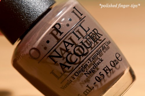
How Great is Your Dane? OPI Nordic Collection

Hello lovelies :) Today I have a polish from this year's "Nordic" Fall collection by OPI - How Great is Your Dane? Pictured here I'm wearing three coats with NE base and Essie Good to Go to top it off.  This would have been fine with an easy two coats, but I'm a spaz and made a mess that needed a second coat to fix.


This chocolaty beauty is a silky smooth crème with a colour that's tricky to describe, it is predominantly brown but with strong grey tones.  I'm not sure exactly what I'd call it, a cool-toned brown? Chocolate Clay? I'm not sure, so I'll stick with gorgeous. The tone is super flattering, and the overall effect is very elegant.


In the bottle this looks like a pale brown, close to the colour of the milk in your coco-pops, but on the nail is comes out darker and with more of a wet-clay effect.  It's definitely one of those polishes that looks a lot nicer on the nail than you'd guess from the bottle.  I'm in love. I'm still a relatively nude newbie, I had no idea that I would like shades like this so much on the nail.  I feel like such a grown up.


Formula is the usual high quality you'd expect from OPI, no issues to report there.  The brush seemed shorter to me than I expect from OPI - have they changed that? I haven't heard any word on the grapevine about a change to the pro-wide.  Perhaps I'm imagining things, sometimes the fumes get to me...